Repositioning a Freight Marketplace into a Workflow Platform
Users could compare options and find cost savings — but couldn’t confidently commit. The platform stopped at selection, leaving users to manage risk and execution off-platform.
Reposition the platform from a comparison tool to a workflow entry point — enabling users to commit with confidence, not just compare options.
Users saved money — and still didn’t come back.
The platform was designed like e-commerce — freight is not e-commerce.
When I joined DMC, the platform had been designed around a simplified, price-led model
of procurement. The product assumed procurement could be reduced to a fast, price-led
interaction.
In reality, selecting a forwarder is a high-risk decision
shaped by uncertainty, liability, and operational consequence.
The model the product was built on did not reflect reality
The product was built on the wrong decision model.
Faster pricing didn’t translate into repeat usage
The platform improved speed at the start of the journey, but failed at the point that mattered — selection and commitment. As a result, usage increased, but transactions and retention did not.
→ Increase
quote-to-award conversion
→ Drive repeat usage across shipments
→ Build liquidity across forwarders
→ Avoided
committing without certainty
→ Required clarification before selection
→ Defaulted to known forwarders
Users tried the platform — then worked around it
Users didn’t fail to choose — the system failed to support the decision. At the point where confidence mattered, the product introduced friction instead of resolving it.
User Behaviour Loop
Fig 1 — Users weren’t choosing between prices — they were managing risk, effort, and uncertainty. The issue wasn’t access to options, but the anxiety of selecting an unknown forwarder.
User Research Quote
We already have forwarders we trust. The platform didn’t make it easier — it just added more to manage.
Logistics Manager, SME importerCost only mattered once everything else felt safe
Importers were not optimising for price alone. They were evaluating whether a forwarder could be trusted to deliver without introducing risk, effort, or uncertainty.
Selection only happened when confidence was high across multiple factors. Any uncertainty stopped the decision entirely.
How selection actually works- Reliability
- Clarity
- Effort
- Risk
- Fit
We redefined what the platform is for
The platform was built for price comparison. We rebuilt it to support decision and execution.
Before - price comparison toolPrice replaced judgement
The interface reduced forwarders to price points.
Key decision inputs - scope, process, and delivery - were not visible at the point of selection. Users could compare quickly, but not decide with confidence.
After — Selection became the start of the workflow
Decisions supported before commitment
Users can evaluate scope, delivery, and process before accepting.
Confidence is built before selection - not after.
Selection transitions into execution
Accepting a quote activates the job — it does not end the interaction.
The platform becomes the system of record from this point forward.
Execution handled in-platform
Tracking, documentation, and updates are managed within the product.
Users no longer rely on external coordination to complete the shipment.
We traded simplicity for decision confidence
We prioritised decision confidence over speed and simplicity — accepting increased complexity at the point of evaluation.
More effort to evaluate
Quotes were structured around real service differences rather than flattened for speed. Each one took more effort to review — but users understood what they were actually buying before committing.
Harder to scan and compare
Service variation was made visible rather than uniform. Quotes resisted quick side-by-side comparison — but users could evaluate substance, not just price.
A heavier evaluation flow
Key detail was moved upfront rather than hidden behind progressive disclosure. The process felt heavier — but removed the need for off-platform back-and-forth at the point of decision.
A broader, more complex product
Workflow support was built into the platform rather than kept transactional. The product became harder to scope — but prevented drop-off after selection and supported real operations.
We removed the illusion of simplicity to enable confident decisions.
The interface was redesigned to support evaluation, decision, and commitment
The interface was redesigned not just to compare prices, but to support evaluation, surface differences, and create a clear moment of commitment.
Trust as the entry point
The redesigned interface leads with forwarder credibility and service clarity. Price becomes the final filter — not the first impression.
Evaluation
Compare services, not just prices
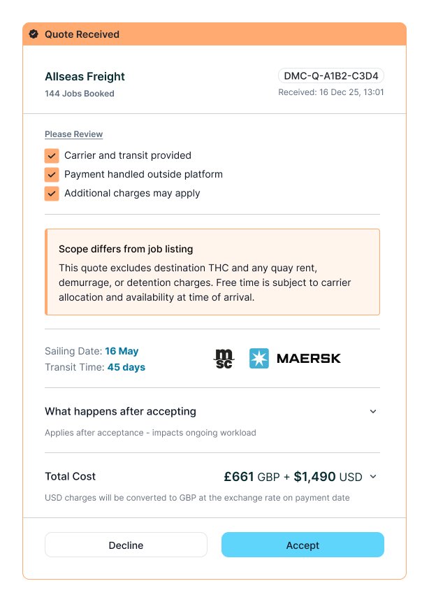
Structured quotes aligned to a defined service. Consistent inputs enabling like-for-like comparison. Clear scope of what is being offered.
Decision
Make differences visible before commitment
Inclusions and exclusions surfaced explicitly. Variation between quotes made legible. Reduced need for interpretation or follow-up.
Commitment
Selection becomes a commitment, not a guess
Defined service carried forward at selection. Clear expectations set before engagement. Reduced likelihood of post-selection surprises.
Comparison view — annotated primary view
Expanded quote breakdown — detail layer
Selection moment — interaction / state change
We traded growth speed for product correctness
This shift moved the platform away from a simple comparison tool toward a more structured, opinionated product. It aligned with real user behaviour — but introduced product and marketplace risk.
Strategic Trade-offs-
01
Simplicity → Accuracy
Less lightweight, but more representative of real-world complexity -
02
Broad appeal → Targeted fit
Reduced universality, increased relevance for SMB importers -
03
Fast transactions → Informed decisions
More deliberate selection, with potential impact on short-term conversion -
04
Marketplace neutrality → Product opinion
Shifted from displaying options to shaping how decisions are made
Reduced emphasis on price could weaken perceived cost advantage
Increased structure could discourage less experienced users
Forwarders could resist transparency or standardisation
Off-platform behaviour when relationships were established
Fee model incentivising disintermediation
The product became more correct — but less forgiving.
Selection became clearer — and required less intervention
- Minimal service detail
- No scope defined
- Assumption-based
- Inclusions unclear
- Follow-up required
- Decision delayed
- Risk unresolved
- Default to known
- Good results: off-platform
- Poor results: churn
- Defined scope
- Clear inclusions
- Like-for-like comparison
- Variation made legible
- Reduced hesitation
- Expectations set
- No validation loop
- Engaged new forwarders
Selection shifted from clarification-led to comparison-led, with users making decisions based on visible service differences rather than defaulting to existing relationships. This reduced the need to move off-platform to validate decisions, enabling users to progress directly from comparison to commitment.
Before vs After behaviour loop
The problem wasn’t the interface — it was the model
The platform did not fail due to lack of features, but due to a mismatch between how it was designed and how freight procurement actually works. It treated procurement as a transactional, price-led interaction — when in reality it is a decision and operational process shaped by risk, clarity, and coordination.
The ShiftThis required moving from simplifying the problem → to representing it correctly — and designing for how users actually operate, not how the process appears on the surface.
Effective products don’t reduce complexity — they make it legible.